How to Design Custom Buttons That Look Professional and Memorable
Choose One Clear Purpose
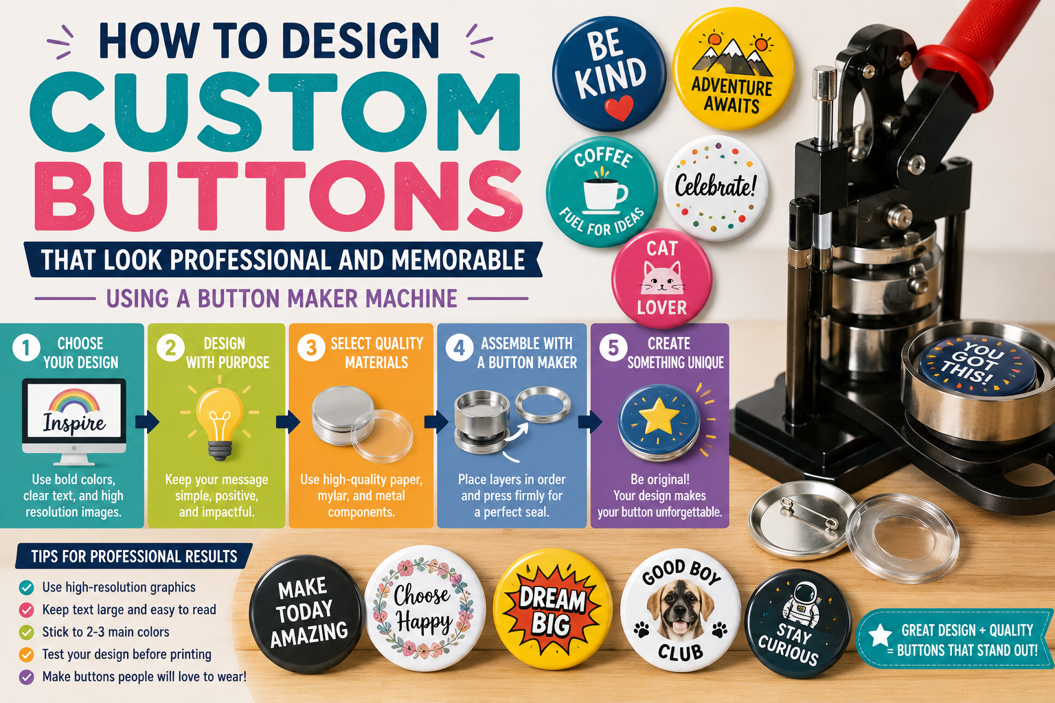
Before designing a button, decide what it needs to do. Is it promoting a business, celebrating an event, supporting a cause, adding humor, or identifying a group? One clear purpose will make every design choice easier.
Keep the Message Short
Buttons are small, so short phrases work best. Use a few strong words instead of a long sentence. A button that says “Ask Me About Art” or “Team Volunteer” is easier to read than a crowded design.
Use Strong Contrast
Text should stand out from the background. Dark letters on a light background or light letters on a dark background are easiest to read. Avoid placing small text over busy images.
Pick Fonts Carefully
Use bold, simple fonts for the main message. Decorative fonts can work for one or two large words, but they should still be readable from a distance.
Balance Words and Images
A button can include text, an icon, a logo, or a small illustration. Do not crowd the space. Leave breathing room around the edges so the design does not feel cramped.
Match Colors to the Mood
Bright colors feel fun and energetic. Soft colors feel friendly and handmade. Black, white, gold, and navy can feel professional or elegant. Choose colors that match the message.
Proof Before Printing
Check spelling, spacing, alignment, and image quality before printing. A small mistake becomes very noticeable when the same button is printed many times.
Final Thoughts
Professional custom button design is simple, clear, and intentional. When the words, colors, and images work together, your button becomes a small item with a big impact.